
ROC Curve (Receiver Operating Characteristics)
ROC (Receiver Operating Characteristic) curves are a valuable tool for evaluating binary classification models, especially in scenarios where you want to assess the trade-off between false positives and true positives at different decision thresholds.
The ROC curve visually represents the performance of a model by plotting the TPR (True Positive Rate or Sensitivity) against the FPR (False Positive Rate or 1 – Specificity) at various threshold settings. The area under the ROC curve (AUC-ROC) is a summary measure of a model’s overall performance, with a higher AUC indicating better discrimination between positive and negative cases.
ROC curves help you make informed decisions about the choice of threshold that balances your priorities between minimizing false positives (FPR) and maximizing true positives (TPR) based on the specific context and requirements of your problem.
| Actual Values | Negative Predictions | positive Predictions | |
|---|---|---|---|
| g(xi)<t | g(xi)>=t | ||
| Negative Example y=0 | TN | FP | FPR = FP/(TN + FP) |
| Positive Example y=1 | FN | TP | TPR = TP/(FN + TP) |
tpr = tp / (tp + fn)
tpr
# Output: 0.5440414507772021
recall
# Output: 0.5440414507772021
# --> tpr = recall

fpr = fp / (fp + tn)
fpr
# Output: 0.09872922776148582
The ROC curve is a useful visualization tool that allows you to assess the performance of a binary classification model across a range of decision thresholds.
scores = []
thresholds = np.linspace(0, 1, 101)

for t in thresholds:
    actual_positive = (y_val == 1)
    actual_negative = (y_val == 0)

    predict_positive = (y_pred >= t)
    predict_negative = (y_pred < t)

    tp = (predict_positive & actual_positive).sum()
    tn = (predict_negative & actual_negative).sum()

    fp = (predict_positive & actual_negative).sum()
    fn = (predict_negative & actual_positive).sum()

    scores.append((t, tp, tn, fp, fn))

scores

# Output:
# [(0.0, 386, 0, 1023, 0),
# (0.01, 385, 110, 913, 1),
# (0.02, 384, 193, 830, 2),
# (0.03, 383, 257, 766, 3),
# (0.04, 381, 308, 715, 5),
# (0.05, 379, 338, 685, 7),
# (0.06, 377, 362, 661, 9),
# (0.07, 372, 382, 641, 14),
# (0.08, 371, 410, 613, 15),
# (0.09, 369, 443, 580, 17),
# (0.1, 366, 467, 556, 20),
# (0.11, 365, 495, 528, 21),
# (0.12, 365, 514, 509, 21),
# (0.13, 360, 546, 477, 26),
# (0.14, 355, 570, 453, 31),
# (0.15, 351, 588, 435, 35),
# (0.16, 347, 604, 419, 39),
# (0.17, 346, 622, 401, 40),
# (0.18, 344, 639, 384, 42),
# (0.19, 338, 654, 369, 48),
# (0.2, 333, 667, 356, 53),
# (0.21, 330, 682, 341, 56),
# (0.22, 323, 701, 322, 63),
# (0.23, 320, 710, 313, 66),
# (0.24, 316, 719, 304, 70),
# ...
# (0.96, 0, 1023, 0, 386),
# (0.97, 0, 1023, 0, 386),
# (0.98, 0, 1023, 0, 386),
# (0.99, 0, 1023, 0, 386),
# (1.0, 0, 1023, 0, 386)]
We end up with 101 confusion matrices evaluated for different thresholds. Let’s turn that into a dataframe.
columns = ['threshold', 'tp', 'tn', 'fp', 'fn']
df_scores = pd.DataFrame(scores, columns=columns)
df_scores
| threshold | TP | TN | FP | FN | |
|---|---|---|---|---|---|
| 0 | 0.00 | 386 | 0 | 1023 | 0 |
| 1 | 0.01 | 385 | 110 | 913 | 1 |
| 2 | 0.02 | 384 | 193 | 830 | 2 |
| 3 | 0.03 | 383 | 257 | 766 | 3 |
| 4 | 0.04 | 381 | 308 | 715 | 5 |
| … | … | … | … | … | … |
| 96 | 0.96 | 0 | 1023 | 0 | 386 |
| 97 | 0.97 | 0 | 1023 | 0 | 386 |
| 98 | 0.98 | 0 | 1023 | 0 | 386 |
| 99 | 0.99 | 0 | 1023 | 0 | 386 |
| 100 | 1.00 | 0 | 1023 | 0 | 386 |
We can look at each tenth record by using this column 10 operator. This works by printing every record starting from the first record and moving forward with increments of 10.
df_scores[::10]
| threshold | tp | tn | fp | fn | |
|---|---|---|---|---|---|
| 0 | 0.0 | 386 | 0 | 1023 | 0 |
| 10 | 0.1 | 366 | 467 | 556 | 20 |
| 20 | 0.2 | 333 | 667 | 356 | 53 |
| 30 | 0.3 | 284 | 787 | 236 | 102 |
| 40 | 0.4 | 249 | 857 | 166 | 137 |
| 50 | 0.5 | 210 | 922 | 101 | 176 |
| 60 | 0.6 | 150 | 970 | 53 | 236 |
| 70 | 0.7 | 76 | 1003 | 20 | 310 |
| 80 | 0.8 | 13 | 1022 | 1 | 373 |
| 90 | 0.9 | 0 | 1023 | 0 | 386 |
| 100 | 1.0 | 0 | 1023 | 0 | 386 |
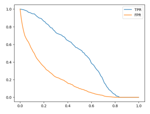
df_scores['tpr'] = df_scores.tp / (df_scores.tp + df_scores.fn)
df_scores['fpr'] = df_scores.fp / (df_scores.fp + df_scores.tn)
df_scores[::10]
| threshold | tp | TN | FP | FN | tpr | fpr | |
|---|---|---|---|---|---|---|---|
| 0 | 0.0 | 386 | 0 | 1023 | 0 | 1.000000 | 1.000000 |
| 10 | 0.1 | 366 | 467 | 556 | 20 | 0.948187 | 0.543500 |
| 20 | 0.2 | 333 | 667 | 356 | 53 | 0.862694 | 0.347996 |
| 30 | 0.3 | 284 | 787 | 236 | 102 | 0.735751 | 0.230694 |
| 40 | 0.4 | 249 | 857 | 166 | 137 | 0.645078 | 0.162268 |
| 50 | 0.5 | 210 | 922 | 101 | 176 | 0.544041 | 0.098729 |
| 60 | 0.6 | 150 | 970 | 53 | 236 | 0.388601 | 0.051808 |
| 70 | 0.7 | 76 | 1003 | 20 | 310 | 0.196891 | 0.019550 |
| 80 | 0.8 | 13 | 1022 | 1 | 373 | 0.033679 | 0.000978 |
| 90 | 0.9 | 0 | 1023 | 0 | 386 | 0.000000 | 0.000000 |
| 100 | 1.0 | 0 | 1023 | 0 | 386 | 0.000000 | 0.000000 |
plt.plot(df_scores.threshold, df_scores['tpr'], label='TPR')
plt.plot(df_scores.threshold, df_scores['fpr'], label='FPR')
plt.legend()
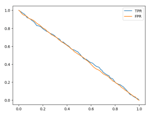
Random model
np.random.seed(1)
y_rand = np.random.uniform(0, 1, size=len(y_val))
y_rand.round(3)
# Output: array([0.417, 0.72 , 0.   , ..., 0.774, 0.334, 0.089])
# Accuracy for our random model is around 50%
((y_rand >= 0.5) == y_val).mean()

# Output: 0.5017743080198722
Let’s put the previously used code into a function.
def tpr_fpr_dataframe(y_val, y_pred):
    scores = []
    thresholds = np.linspace(0, 1, 101)

    for t in thresholds:
        actual_positive = (y_val == 1)
        actual_negative = (y_val == 0)

        predict_positive = (y_pred >= t)
        predict_negative = (y_pred < t)

        tp = (predict_positive & actual_positive).sum()
        tn = (predict_negative & actual_negative).sum()

        fp = (predict_positive & actual_negative).sum()
        fn = (predict_negative & actual_positive).sum()

        scores.append((t, tp, tn, fp, fn))

    columns = ['threshold', 'tp', 'tn', 'fp', 'fn']
    df_scores = pd.DataFrame(scores, columns=columns)

    df_scores['tpr'] = df_scores.tp / (df_scores.tp + df_scores.fn)
    df_scores['fpr'] = df_scores.fp / (df_scores.fp + df_scores.tn)

    return df_scores
df_rand = tpr_fpr_dataframe(y_val, y_rand)
df_rand[::10]
| threshold | tp | tn | fp | fn | tpr | fpr | |
|---|---|---|---|---|---|---|---|
| 0 | 0.0 | 386 | 0 | 1023 | 0 | 1.000000 | 1.000000 |
| 10 | 0.1 | 347 | 100 | 923 | 39 | 0.898964 | 0.902248 |
| 20 | 0.2 | 307 | 201 | 822 | 79 | 0.795337 | 0.803519 |
| 30 | 0.3 | 276 | 299 | 724 | 110 | 0.715026 | 0.707722 |
| 40 | 0.4 | 237 | 399 | 624 | 149 | 0.613990 | 0.609971 |
| 50 | 0.5 | 202 | 505 | 518 | 184 | 0.523316 | 0.506354 |
| 60 | 0.6 | 161 | 614 | 409 | 225 | 0.417098 | 0.399804 |
| 70 | 0.7 | 121 | 721 | 302 | 265 | 0.313472 | 0.295210 |
| 80 | 0.8 | 78 | 817 | 206 | 308 | 0.202073 | 0.201369 |
| 90 | 0.9 | 40 | 922 | 101 | 346 | 0.103627 | 0.098729 |
| 100 | 1.0 | 0 | 1023 | 0 | 386 | 0.000000 | 0.000000 |
plt.plot(df_rand.threshold, df_rand['tpr'], label='TPR')
plt.plot(df_rand.threshold, df_rand['fpr'], label='FPR')
plt.legend()
Let’s examine an example using a threshold of 0.6. On the x-axis, we have our thresholds, and when we set the threshold to 0.6, we obtain a True Positive Rate (TPR) of 0.4 and a False Positive Rate (FPR) of 0.4.
The reason behind these values is that our model’s predictions are nearly equivalent to tossing a coin. In 60% of cases, the model predicts that a customer is non-churning, and in 40% of cases, it predicts that the customer is churning. In other words, these rates indicate that the model predicts a customer as churning with a 40% probability and as non-churning with a 60% probability. Consequently, the model is incorrect for non-churning customers in 40% of cases.
Ideal model
Now, let’s discuss the concept of an ideal model that makes correct predictions for every example. To implement this, we need to determine the number of negative examples, which corresponds to the number of people who are not churning in our dataset.
num_neg = (y_val == 0).sum()
num_pos = (y_val == 1).sum()
num_neg, num_pos

# Output: (1023, 386)
To create the ideal model’s predictions for our validation set, we first create a y_ideal array that contains only negative observations (0s) followed by positive observations (1s). We use the np.repeat() function to achieve this, creating an array with 1023 zeros and then 386 ones.
y_ideal = np.repeat([0, 1], [num_neg, num_pos])
y_ideal

# Output: array([0, 0, 0, ..., 1, 1, 1])
To create our predictions for the ideal model, which are numbers between 0 and 1, we can use the np.linspace() function to generate an array of evenly spaced values between 0 and 1. This array should have the same length as y_ideal, which is 1409 in this case.
y_ideal_pred = np.linspace(0, 1, len(y_ideal))
y_ideal_pred

# Output:
# array([0.00000000e+00, 7.10227273e-04, 1.42045455e-03, ...,
#       9.98579545e-01, 9.99289773e-01, 1.00000000e+00])
1 - y_val.mean()
# Output: 0.7260468417317246
accuracy_ideal = ((y_ideal_pred >= 0.726) == y_ideal).mean()
accuracy_ideal

# Output: 1.0
The ideal model, which makes perfect predictions, doesn’t exist in reality, but it serves as a benchmark to understand how well our actual model is performing. By comparing our model’s performance to that of the ideal model, we can assess how much room for improvement there is.
df_ideal = tpr_fpr_dataframe(y_ideal, y_ideal_pred)
df_ideal[::10]
| threshold | tp | tn | fp | fn | tpr | fpr | |
|---|---|---|---|---|---|---|---|
| 0 | 0.0 | 386 | 0 | 1023 | 0 | 1.000000 | 1.000000 |
| 10 | 0.1 | 386 | 141 | 882 | 0 | 1.000000 | 0.862170 |
| 20 | 0.2 | 386 | 282 | 741 | 0 | 1.000000 | 0.724340 |
| 30 | 0.3 | 386 | 423 | 600 | 0 | 1.000000 | 0.586510 |
| 40 | 0.4 | 386 | 564 | 459 | 0 | 1.000000 | 0.448680 |
| 50 | 0.5 | 386 | 704 | 319 | 0 | 1.000000 | 0.311828 |
| 60 | 0.6 | 386 | 845 | 178 | 0 | 1.000000 | 0.173998 |
| 70 | 0.7 | 386 | 986 | 37 | 0 | 1.000000 | 0.036168 |
| 80 | 0.8 | 282 | 1023 | 0 | 104 | 0.730570 | 0.000000 |
| 90 | 0.9 | 141 | 1023 | 0 | 245 | 0.365285 | 0.000000 |
| 100 | 1.0 | 1 | 1023 | 0 | 385 | 0.002591 | 0.000000 |
plt.plot(df_ideal.threshold, df_ideal['tpr'], label='TPR')
plt.plot(df_ideal.threshold, df_ideal['fpr'], label='FPR')
plt.legend()

What we see here is that TPR almost always stays around 1 and starts to go down after the threshold of 0.726. So, this model can correctly identify churning customers up to that threshold. For people who are not churning but are classified as churning by the model when the threshold is below 0.726, the model is not always correct. However, the detection becomes always true after the threshold of 0.726.
Let’s take another example with a threshold of 0.4. The FPR is around 45%, and the model makes some mistakes. So, for around 32% of people who are predicted as non-churning when the threshold is set to 0.726 but are below that threshold, we predict them as churning even though they are not.
Putting everything together
Now let’s try to plot all the models together so we can hold the benchmarks together.
plt.plot(df_scores.threshold, df_scores['tpr'], label='TPR')
plt.plot(df_scores.threshold, df_scores['fpr'], label='FPR')

#plt.plot(df_rand.threshold, df_rand['tpr'], label='TPR')
#plt.plot(df_rand.threshold, df_rand['fpr'], label='FPR')

plt.plot(df_ideal.threshold, df_ideal['tpr'], label='TPR', color = 'black')
plt.plot(df_ideal.threshold, df_ideal['fpr'], label='FPR', color = 'black')

plt.legend()

We see that our TPR is far from the ideal model. We want it to be as close as possible to 1. We also notice that our FPR is significantly different from that of the ideal model. Plotting against the threshold is not always intuitive. For example, in our model, the best threshold is 0.5, as we know from accuracy. However, for the ideal model, as we saw earlier, the best threshold is 0.726. So they have different thresholds. What we can do to better visualize this is to plot FPR against TPR. On the x-axis, we’ll have FPR, and on the y-axis, we’ll have TPR. To make it easier to understand, we can also add the benchmark lines.
plt.figure(figsize=(5,5))

plt.plot(df_scores.fpr, df_scores.tpr, label='model')
plt.plot([0,1], [0,1], label='random')
#plt.plot(df_rand.fpr, df_rand.tpr, label='random')
#plt.plot(df_ideal.fpr, df_ideal.tpr, label='ideal')

plt.xlabel('FPR')
plt.ylabel('TPR')

plt.legend()

In the curve of the ideal model, there is one crucial point, often referred to as the ‘north star’ or ideal spot, located in the upper-left corner where TPR is 100% and FPR is 0%. This point represents the optimal performance we aim to achieve with our model. A ROC curve visualizes this by plotting TPR against FPR, and we usually add a diagonal random baseline. Our goal is to make our model’s curve as close as possible to this ideal spot, which means simultaneously being as far away as possible from the random baseline. In essence, if our model closely resembles the random baseline model, it is not performing well.
# We can also use the ROC functionality of scikit learn package
from sklearn.metrics import roc_curve

fpr, tpr, thresholds = roc_curve(y_val, y_pred)

plt.figure(figsize=(5,5))

plt.plot(fpr, tpr, label='Model')
plt.plot([0,1], [0,1], label='Random', linestyle='--')

plt.xlabel('FPR')
plt.ylabel('TPR')

plt.legend()

What kind of information do we get from ROC curve?
Let’s begin in the lower-left corner, where both TPR and FPR are 0. This occurs at higher thresholds like 1.0. In this scenario, we predict that every customer is non-churning, resulting in TPR being 0 since we don’t predict anyone as churning. FPR is also 0 because there are no false positives; we only have true negatives (TN).
As we move from the lower left corner, where the threshold starts at 1.0, we eventually reach the upper-right corner with a threshold of 0.0. Here, our model achieves 100% TPR because we predict everyone as churning, enabling us to identify all churning customers. However, we also make many mistakes, incorrectly identifying non-churning customers. Thus, we have TPR = FPR = 100%.
When we adjust the threshold, we predict more customers as churning, causing our TPR to increase, but the FPR also increases concurrently.
The ROC curve allows us to observe how the model behaves at different thresholds. Each point on the ROC curve represents TPR and FPR evaluated at a specific threshold. By plotting this curve, we can assess how far the model is from the ideal spot and how far it is from the random baseline. Additionally, the ROC curve is useful for comparing different models, as it’s easy to determine which one is superior (a model closer to the ideal spot is better, while one closer to the random baseline is worse).
There is an interesting metric derived from the ROC curve known as AUC, which stands for the area under the curve.
