
Car price baseline model
This article is about building a baseline model for price prediction of a car. Here we’ll use the implemented code from the last article to build the model. First we start with a simple model while we’re using only numerical columns.
The next code snippet shows how to extract all numerical columns. By the way you can also use it to extract categorical columns.
df_train.dtypes

# Output:
# make                  object
# model                 object
# year                   int64
# engine_fuel_type      object
# engine_hp            float64
# engine_cylinders     float64
# transmission_type     object
# driven_wheels         object
# number_of_doors      float64
# market_category       object
# vehicle_size          object
# vehicle_style         object
# highway_mpg            int64
# city_mpg               int64
# popularity             int64
# dtype: object

df_train.columns
# Output:
# Index(['make', 'model', 'year', 'engine_fuel_type', 'engine_hp',
#       'engine_cylinders', 'transmission_type', 'driven_wheels',
#       'number_of_doors', 'market_category', 'vehicle_size', 'vehicle_style',
#       'highway_mpg', 'city_mpg', 'popularity'],
#      dtype='object')
We choose the columns engine_hp, engine_cylinders, highway_mpg, city_mpg, and popularity for our base model.
base = ['engine_hp', 'engine_cylinders', 'highway_mpg', 'city_mpg', 'popularity']

df_train[base].head()
| engine_hp | engine_cylinders | highway_mpg | city_mpg | popularity | |
|---|---|---|---|---|---|
| 0 | 310.0 | 8.0 | 18 | 13 | 1851 |
| 1 | 170.0 | 4.0 | 32 | 24 | 640 |
| 2 | 165.0 | 6.0 | 15 | 13 | 549 |
| 3 | 150.0 | 4.0 | 39 | 28 | 873 |
| 4 | 510.0 | 8.0 | 19 | 13 | 258 |
Value extraction
We need to extract the values to use them in training.
X_train = df_train[base].values
X_train
# Output:
#array([[ 310.,    8.,   18.,   13., 1851.],
#            [ 170.,    4.,   32.,   24.,  640.],
#            [ 165.,    6.,   15.,   13.,  549.],
#            ...,
#            [ 342.,    8.,   24.,   17.,  454.],
#            [ 170.,    4.,   28.,   23., 2009.],
#            [ 160.,    6.,   19.,   14.,  586.]])
Missing values
Missing values are generally not good for our model. Therefore, you should always check whether such values are present.
df_train[base].isnull().sum()
# Output:
# engine_hp           42
# engine_cylinders    17
# highway_mpg          0
# city_mpg             0
# popularity           0
# dtype: int64
As you can see there are two columns that have missing values. The easiest thing we can do is fill them with zeros. But notice filling it with 0 makes the model ignore this feature, because:
g(xi) = w0 + xi1w1 + xi2w2
if xi1 = 0 then the last equation simplifies to
g(xi) = w0 + 0 + xi2w2
But 0 is not always the best way to deal with missing values, because that means there is an observation of a car with 0 cylinders or 0 horse powers. And a car without cylinders or 0 horse powers does not make much sense at this point. For the current example this procedure is sufficient for us.
df_train[base].fillna(0).isnull().sum()
# Output:
# engine_hp           0
# engine_cylinders    0
# highway_mpg         0
# city_mpg            0
# popularity          0
# dtype: int64
As you can see in the last snippet, the missing values have disappeared. However, now we need to apply this change in the DataFrame.
X_train = df_train[base].fillna(0).values
X_train
# Output:
# array([[ 310.,    8.,   18.,   13., 1851.],
#             [ 170.,    4.,   32.,   24.,  640.],
#             [ 165.,    6.,   15.,   13.,  549.],
#             ...,
#             [ 342.,    8.,   24.,   17.,  454.],
#             [ 170.,    4.,   28.,   23., 2009.],
#             [ 160.,    6.,   19.,   14.,  586.]])

y_train
# Output:
# array([10.40262514, 10.06032035,  7.60140233, ..., 10.92181127,
        9.91100919,  8.10892416])
Now we can train our model using the train_linear_regression function that we’ve implemented in the last article. The function return the value for w0 and and array for vector w.
w0, w = train_linear_regression(X_train, y_train)
w0, w
# Output:
# (7.471835414587793,
 array([ 9.30959186e-03, -1.19533938e-01,  4.68925224e-02, -1.13441722e-02,
        -1.01631104e-05]))
We can use this two variables to apply the model to our training dataset to see how well the model has learned the training data. We do not want the model to simply memorize the data, but to recognize the correlations. Later, we’ll also apply the model to unseen data so that we can eliminate memorization.
y_pred = w0 + X_train.dot(w)
y_pred
# Output:
# array([10.07931663,  9.79812647,  8.84104849, ..., 10.62739988,
        9.60798726,  8.97035041])
Plotting model performance
Three snippets before, you can see the actual values for y. The last snippet shows the predicted values for y. You could now go through these two lists manually and compare them. A better and also visual possibility is provided by Seaborn. The next snippet shows how to output these two lists accordingly.
# alpha changes the transparency of the bars
# bins specifies the number of bars
sns.histplot(y_pred, color='red', alpha=0.5, bins=50)
sns.histplot(y_train, color='blue', alpha=0.5, bins=50)
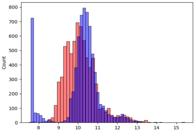
You see from this plot that the model is not ideal but it’s better to have an objective way of saying that the model is good or not good. When we start improving the model, we also want to ensure that we really improving it. The next article is about an objective way to evaluate the performance of a regression model.
